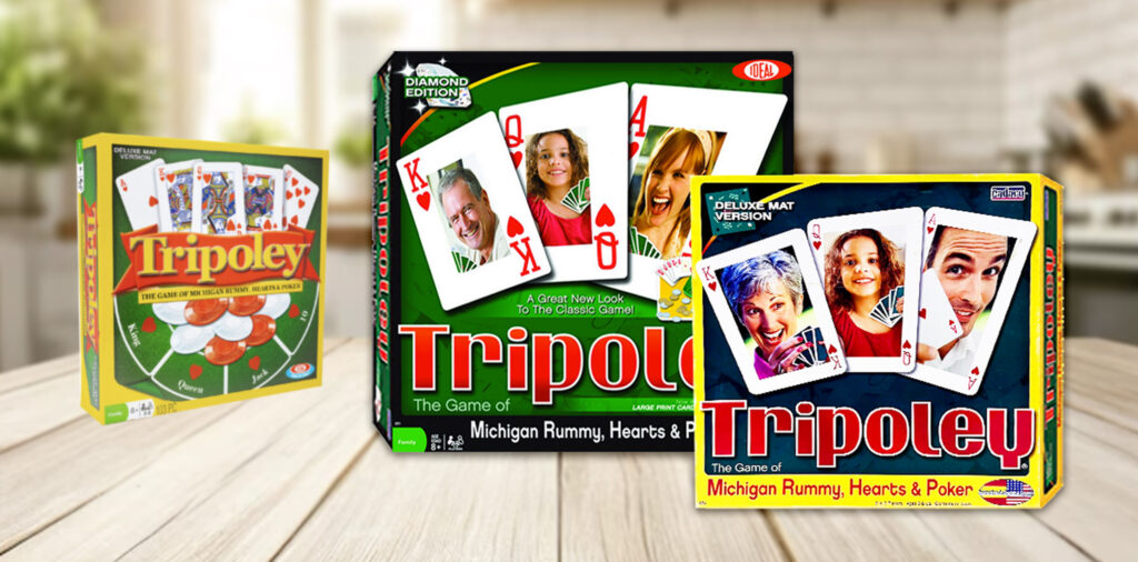
In the mid-1990s I was the Art Director for Cadaco Games, an iconic toy and game manufacturer in Chicago. Their Tripoley game, among others, were family favorites for generations. Infact, it has been listed among the top 100 games of all time.
The Challenge
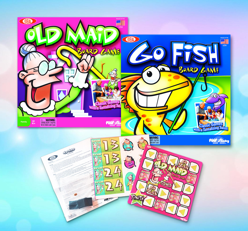
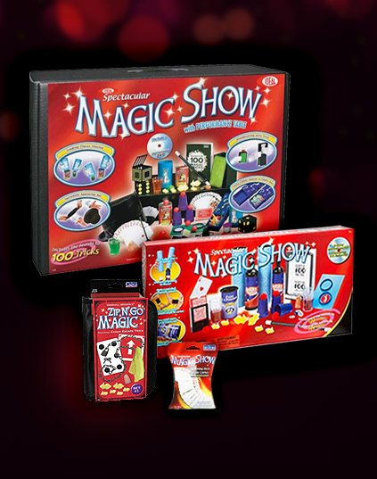
Many of the long standing brands were starting to look out dated on the shelf and the buyers were losing interest. It was determined that a refresh of the packaging across the board was needed.
I was warned that refreshing classic brands might be like “trying to put make up on your momma” because everyone will have a strong opinion about it!
My Work
After some extensive store audits to assess the trends and colors that were most common in the toy aisles, I created designs with dynamic imagery and vibrant colors that stood out compared to the competition.
The design focused on a generations of family fun theme but with a more contemporary style.
The Result
The response was overwhelming!
Sales of Tripoley actually doubled in the first year of the roll-out and led to additional shelf space at our biggest retailers.
Sales of the entire Family Games category jumped 10% thanks to the revitalized branding.