

Drawing With Wolves
The Chicago Wolves hockey team was about to start it’s inaugural season and everything was coming together, except for the team logo.
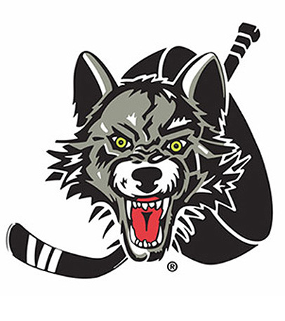 Grant Mulvey, the President and Head Coach of the team was not happy with the design they developed with a high-priced agency. He lamented that it looked more like a scared bear than a wolf and that “it has to look mean!”. He wanted his franchise logo to illustrate the personality of the team. That’s when he turned to us.
First we enlarged the ears and made them more triangular. Second, we lowered the snout to make it appear longer, like a wolf. Third, by snarling into a mirror we were able to capture the wrinkles and nuances that make a face really look mean and incorporated them into the design.
These three revisions were the equivalent of a graphic design hat trick!
Grant was overjoyed with the transformation and ultimately went forward with the revisions that we added to his logo. The rest is Chicago minor-league sports history.
.
Give Kempler Creative a shot and we’ll score for you every time.