Eye Catching Information
After some extensive research on the way people look at websites, I have shared some of the most interesting findings below. These samples use eye-tracking technology to monitor how viewers actually look at websites and the results can teach us valuable lessons.
A. When you are assembling a persuasive landing page, be sure the elements that “pop” are the ones that matter, and that you aren’t giving too much weight to visuals that don’t encourage customers to take action.
In the sample below, the big, red badge that says “NO FEES” is the main focus of the page and the actual means of contact (phone number) is barely viewed.

.
In the new sample below, the badge was removed and replaced with a contrasting colored button with a link to the contact page. The result was greater focus on the call-to-action.

B. If you want to stand out at the top of some competitive search results, you may want to test an embedded video rather than authorship for product pages.
In the sample below, you can see that viewers eyes were focused more on the embeded video that in the thumbnails, headlines, or any other element of this search engine results page.

C. Visuals are an important part of a site’s overall design, but most pages can be optimized by including images that serve as visual cues for where visitors should look next.
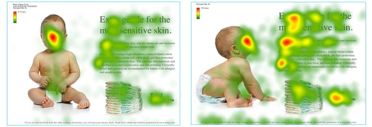
This great example shows that by changing the image of the baby so that it is looking at the call-to-action, it dramatically improves the focus on that part of the page.

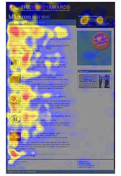
D. Web users tend to browse sites based on their reading habits.
For English speaking people (and languages with similar reading patterns), the left side of the screen is heavily favored, and all sites tend to be browsed in an F-pattern.

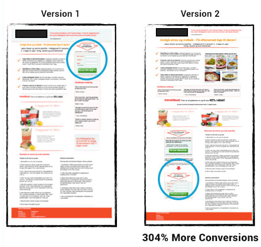
E. It’s okay to place important information “below the fold”.
Although it’s dependent on the page you are testing, you shouldn’t be afraid of placing important elements below the fold (and testing them there), because it gives people time to read your copy before they take action.


